
This image is professional and sleek. The message is that this car brand is saying that the letter their car brand starts with is very powerful. This is powerful. It makes the customer want to buy the product because it's being marketed as powerful. What's not effective is that the customer might not know what the meaning of M being powerful is. This style could be used in a design of mine if I want to show the product is powerful.

Just like the kitten poster, this sign uses humor to make the viewer laugh and remember it. Another thing the two of them have in common is the bolded word with color to catch the eye of the viewer, in this one they used "⚠️WARNING" to catch the viewers' attention.
|
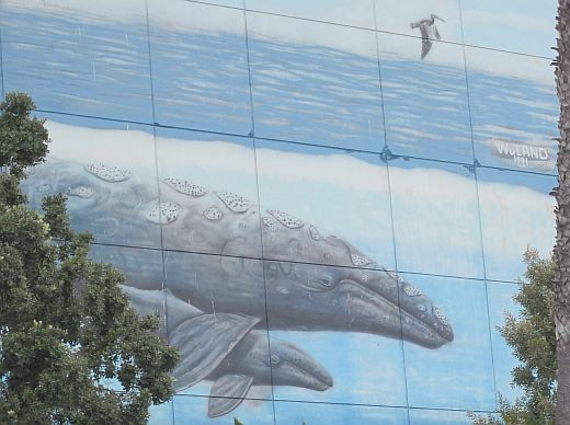
The artist uses nature, color, size, and beauty to make the neighborhood look good, and the neighbors feel good. Using nature is a tool that is powerful and can be used to make people feel good about the designs that I create. This one is my favorite because of how much I love nature.
|

The designer is using humor to make the viewer laugh and feel good. They also used "ATTENTION!!!!!!!" to catch my eye and grab my attention. Using certain fonts, colors, and words will get the attention of people. Making my message funny will make them remember it.
|

Just like in the mural with the whales the artist here used nature, beauty, and vibrant colors. This designer did a great job focusing on the sun and the hands. Using vibrant colors in my designs can grab the attention of my audience.

The designer is using realism and shadows in their design, but they also are using parts that aren't real like the heart-shaped balloon. Most importantly the designer uses feeling and emotion. This work is emotional because Kobe Bryant and his daughter Gigi passed away. I really liked this mural because it made me feel like they were being respected. In my designs I can use emotion like love and respect to gain people's attention, and make people feel good about the work.
|
- Home
- Contact
- Infographic
- Into the Wild
- Typography insporations
- Gallery
- Creativity playlist
- Challenge for change
- Flier design
- Era Shoe Design
- Album Cover
- Dilation Book Cover
- YouTube Thumbnail
- Signage Graphic
- Wayfinding Project
- Story project
- Grid Project
- Drawing Project
- Paula scher project
- The Perfect Project
- Final Project: Logo
